
It feels like it has been ages since the WordPress community has had a call for testing Full Site Editing (FSE) features. The FSE Outreach Program was on a small hiatus. However, the WordPress 5.8 launch was also underway last month.
The program is an open call for testing various components of FSE. Thus far, volunteers have successfully provided feedback on features that have already landed in core WordPress, such as block-based widgets and template editing. Testers have delved into others that have yet to be released. Each testing round is open to anyone who can spare a little of their free time and share their findings. The goal is to break things and point out problematic areas of the user experience.
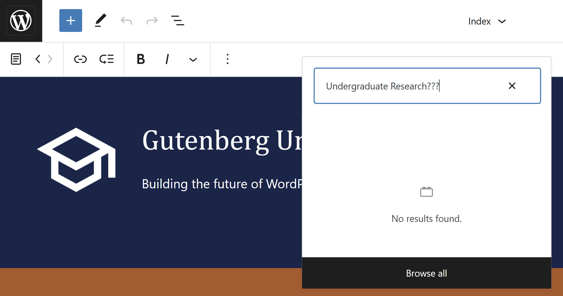
FSE Outreach #9 is a community-driven suggestion that calls for building a Higher Ed site’s header. Volunteers are asked to follow a 26-step process using the site editor beta feature in the latest version of the Gutenberg plugin and the TT1 Blocks theme.
I am a fan of this take on testing, and program lead Anne McCarthy seems to favor doing more of it in the future. “If you’d like to suggest an idea for a call for testing, know it’s very welcomed and all ideas will be weighed against current project priorities to figure out what makes the most sense to pursue,” she wrote in the announcement.
Since the project was all about Higher Ed, I decided to pay homage to my alma mater and use the colors that I wore proudly around campus for five years — and still do to this day. The following screenshot is the end result:

Before going forward, I must admit that I cheated to get that final look. The call for testing asked that we build from the TT1 Blocks theme. I was able to get close to that result, but I had to switch to a custom theme I have been working on to get past a few hurdles.
I went through each stage of testing with TT1 Blocks and will cover the issues I encountered.
Building a Higher Ed Header
Just getting off the ground, I ran into my first issue, which turned out to be a non-issue. The internet gods decided to play a trick on me, disallowing me from editing both the Site Title and Site Description blocks. I really wanted my fictional university to be “Gutenberg University,” but I could not do so without saving my progress and refreshing the browser tab. I was unable to replicate the issue, so I am hoping it was simply a fluke.
Using the Navigation block still seems the most troublesome area of site editing. I know how much work the development team has put behind the user experience for this feature but cannot help but wonder if there is a point where users can opt into managing its content (the links) via the traditional Nav Menus screen in WordPress. The site editor works fine for the design aspect, but I have yet to feel comfortable using it to manage links.
This stage of testing calls for adding multiple page links as both top-level and sub-menu items. When clicking the + button to add a link, my first instinct is to search for the page itself. However, the available field is a block search rather than a page search.
To add an actual link, users must first add the Page Link block. Then, they can search for a specific page. This two-step process gets me every time.
I ran into the issue for nav menus mentioned in the call for testing where there is no space between items when used inside a Columns block. It pains the purist in me to admit it, but I had to use the Spacer block between each item to fix this. I did not need to do this with my custom theme because, I am guessing, I addressed this somewhere along the way.
The “space between items” option also failed to work with the Navigation block, ruining one of the early design ideas I had. I decided to go in a different direction.
Using right-alignment with the Search block did not work. Therefore, I used the 100% width option to align it with my right-aligned nav menu.
Time and time again, I needed to rely on the Spacer block to make adjustments. Part of this was because default margins and paddings are inconsistent among different blocks. The still-missing margin controls on nearly every block also played a hand in this. This is not particularly noteworthy. The development team is aware of and working on extending spacing controls — they just can’t get here fast enough for some of us.
A spacing issue is what led me to ditch TT1 Blocks and switch to a custom theme. The following screenshot is my final work with the former. You may notice the gaping green background between the nav menu group and the header image below it.

No amount of tricks or rearrangement of blocks seemed to remove that space, and I simply could not live with that. I had already solved about 90% of Gutenberg’s spacing issues with my own theme and did not feel like writing any new CSS to address this. Making the switch also meant that I could get rid of several Spacer blocks I had in place.
Aside from dropping in a header image, one other modification I made was skipping the addition of a Button block for the latest “Covid update.” I could not bear looking at TT1 Blocks’ overuse of padding. Instead, I nested a paragraph with a link within a column alongside a Navigation block.
As always, I enjoyed the process. This post is meant to be critical of specific areas in the hopes that it helps build a better WordPress. For all its faults, many other parts offer a solid user experience. Overall, the Gutenberg development team continues to impress.