I was slightly frustrated last week when sharing a tutorial on a hero-style post header. I had planned to create a layout with a left-aligned Group with a maximum width, as shown in the following screenshot:

This would allow the focal point of the background image to shine through on the right. However, neither of the two known techniques seemed to be ideal.
One of the most common methods is to use a 50/50 Columns block, leaving the right column empty. This was messy at some screen sizes. However, as noted by Andrew Starr in the comments, setting a specific width for the left column and clearing the width for the right-side column addresses this issue. Hat tip to him for finding a way to work within the system. Still, it is not the most intuitive method and leaves an empty <div> in the HTML for no good reason. It feels like a hack that we should not be teaching users.
My gut was telling me that my preferred solution was the right one. It was also the simplest to implement without resorting to hacking columns. It uses the content alignment matrix control for the Cover block combined with a set width on an inner Group block. However, I ran into issues with this but did not understand why. That was until I dove back into it this week (I will get to this later). Plus, I am stubborn enough to keep trying something until it magically works.
Therefore, I went back to the drawing board. Tired of looking at the previous design, I pulled up one of the first pattern ideas I had about a year ago and recreated it with the latest design tools:

I also wanted to make sure this solution worked well on any screen size. When moving toward smaller viewports, the content should take up more room until it hits the edge. The method in this tutorial handles this beautifully:

This entry in the Building with Blocks series walks through how to create this layout. As a bonus, I will also show how to accomplish it with the new Stack block in WordPress 6.0 for cases where a Cover container does not make sense.
Building With a Cover Block
For this walkthrough, I am using a custom theme. However, I have also tested with Archeo, Avant-Garde, and Twenty Twenty-Two. It has worked consistently across the entire group. I am also running WordPress 6.0 Beta 1 without the Gutenberg plugin active.
Step 1: Add Cover Block
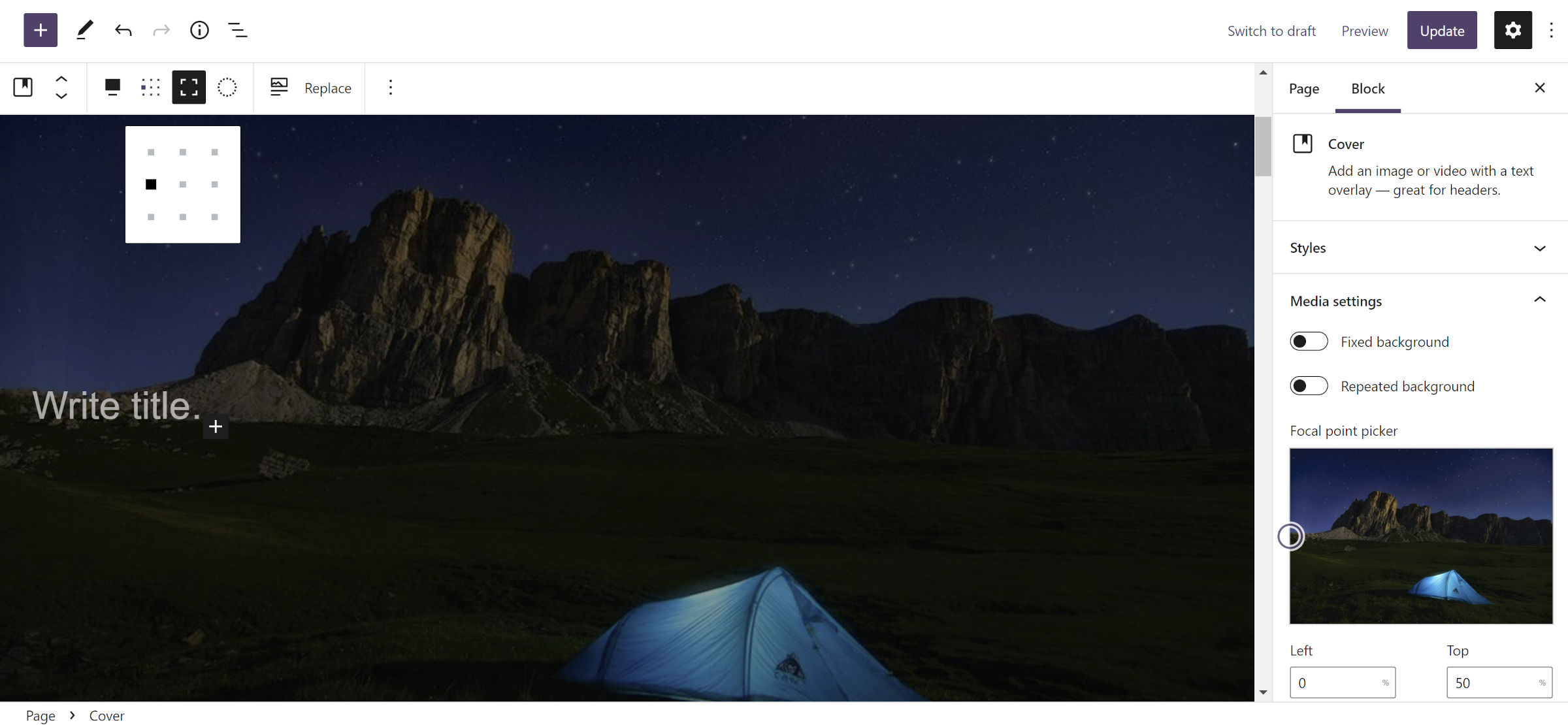
For this step, insert a new Cover block along with your preferred image. Most of the settings are not going to matter. I chose toggle on the full-height and full-width options.
The most crucial part of this step is to select an option from the content alignment matrix control. In the toolbar, it will be an icon with nine tiny squares, almost dots (see screenshot). To align the blocks from the next steps in the left-middle of the Container, select the first “dot” on the second row. Of course, feel free to play around with different options.
Everything else about the Cover design is up to you.
Step 2: Add Fixed-Width Group
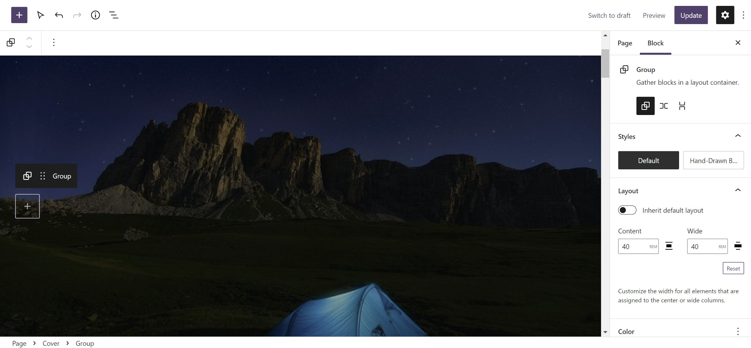
To contain the content you will add in step #3, insert a Group block within the Cover from step #1.
The “Layout” tab in the block sidebar panel contains the only necessary options you must set. You will need to define the content and wide options.
This is the point where I hit a roadblock in my earlier tests. Percent (%) units behave differently from all others. When used, the Group block is always full-width, and its contents are always centered. No others have this issue. However, not all of them may be used for this particular layout. Viewport-width (vw) and viewport-height (vh) units will align as expected but not expand across the screen on smaller devices.
The vital thing to remember is to use a fixed unit type, such as px, em, or rem. You may also select “Inherit default layout,” but how it behaves will depend on your active theme.
I set both the Content and Wide options to 40rem (there is no need for the Wide setting to be larger than Content for this type of design). Technically, this is a max-width value rather than a fixed width. This allows it to adjust to smaller screen sizes.
Step 3: Add Content
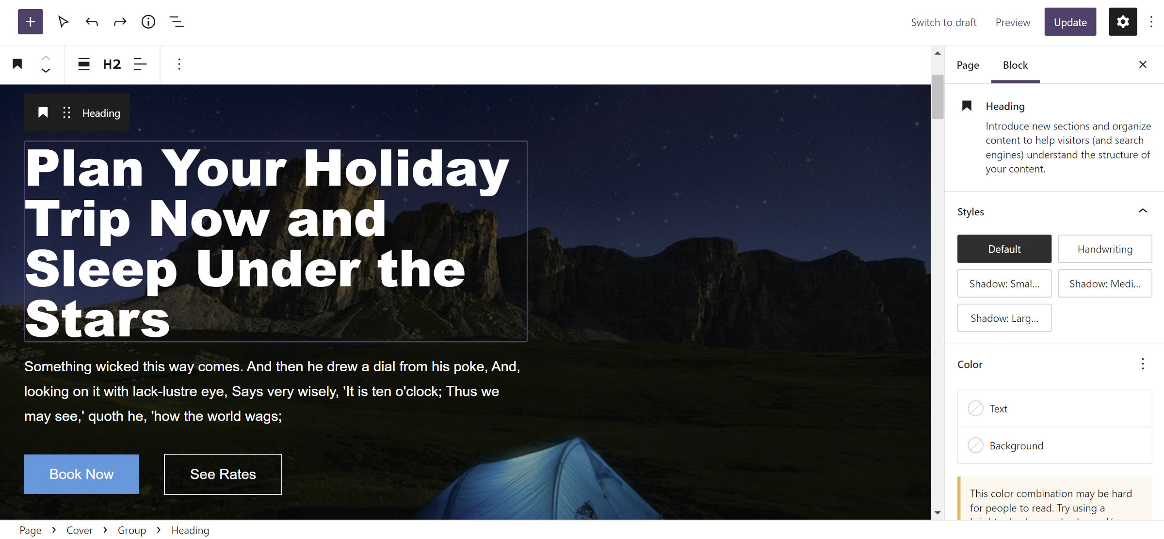
For the final step, you simply need to add your preferred content inside the Group from step #2. I opted for adding Heading, Paragraph, and Buttons blocks. This can be anything you want—there are no rules.
Building With a Stack Block
WordPress 6.0 will introduce a new Stack variation of the Group block. Instead of the typical top-down flow, it is a vertical flex layout. I covered this new block in the Gutenberg 13.0 release post this week.
To test the following technique, you must either install WordPress 6.0 Beta 1 or the latest version of the Gutenberg plugin. The alternative option is to wait a few weeks for the general release.
Step 1: Add a Stack Block
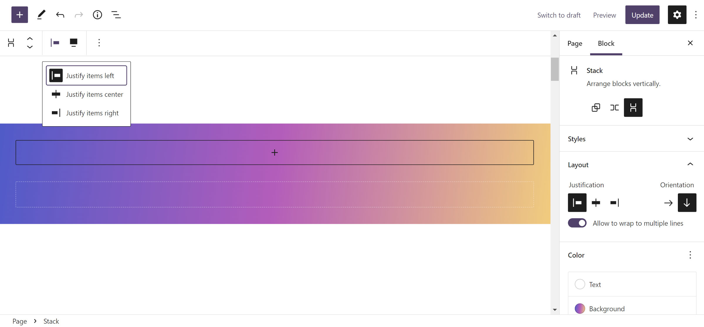
Insert a new Stack block in the content canvas for the first step. You may choose to give it a background color or gradient. I chose the latter to keep things fun.
Unlike the Group block, Stack has content justification controls. If you made it through the first part of this tutorial, you should probably already know where I am going with this. There is a “Justification” control in the sidebar for aligning nested blocks left, center, or right. A duplicate option is also in the toolbar.
As with the Cover block, feel free to play around with the options. Otherwise, set it to “left” to follow along.
Step 2–3: Rinse and Repeat
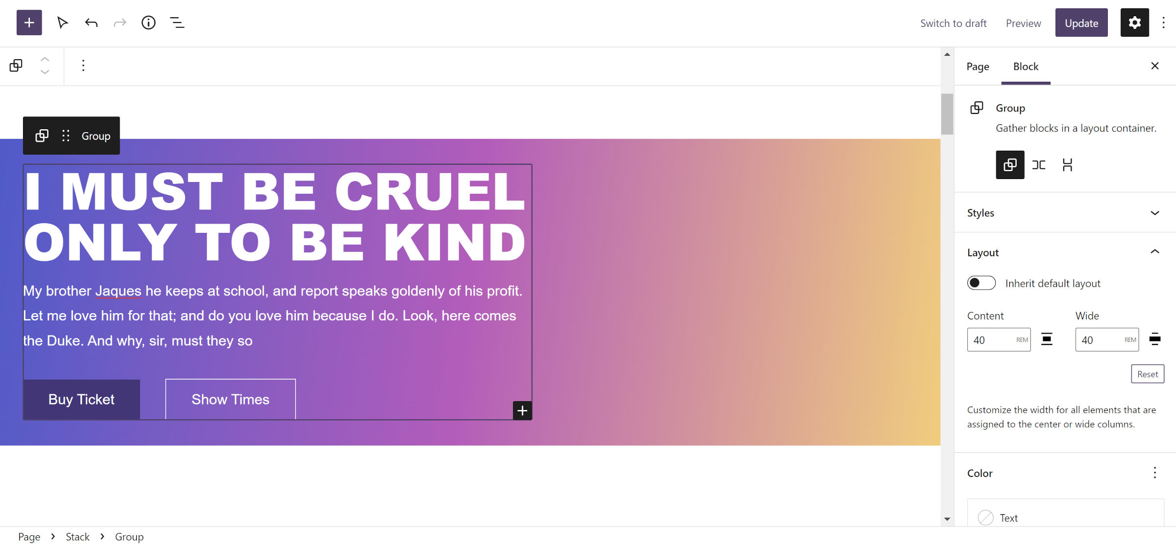
Steps #2 and #3 are literally the same as when using the Cover block as the outer container. Therefore, you need to only repeat the process outlined earlier. Again, the most important thing is to define a fixed width for the Group block.
This ended up being surprisingly easy after the frustration I had last week. This is also an example of how powerful the block editor has become and how the user experience can sometimes not live up to expectations. If I am hitting roadblocks as someone who lives and breathes WordPress almost every waking moment, other users are likely running into those same issues. I hope that I at least shined a little light on one aspect of layout building in this tutorial.

