
On Wednesday, Anne McCarthy announced Round #12 of the FSE Outreach Program. As always, everyone is free to join by testing features and providing direct feedback on problem areas with the design tools in WordPress. Anyone interested should respond by March 16.
For this round, volunteers are tasked with testing some oldies but goodies. Early in the program’s history, anyone who joined did a lot of site header and navigation work. Round #12 asks that users revisit some of these essential tools.
This was an exciting call for testing for me. In early 2021, I had my fair share of frustrations with the FSE experience. There were so many designs I wanted to tackle, but I far too often fell short of creating what I wanted.
Therefore, I hopped back in time and revisited a header design from Round #4 of testing in March 2021. At the time, the WordPress leads were weeks away from deciding whether some FSE-related components would land in WordPress. My conclusion of the tools at the time was:
I came to the realization that attempting to do anything remotely advanced with the site editor was simply not going to happen…As someone who prides himself on near-infinite patience, Round #4 sought to crack me.
I had wanted to recreate elements from the UK-based Pho Cafe page header during testing. It was a tall order that could not be filled.
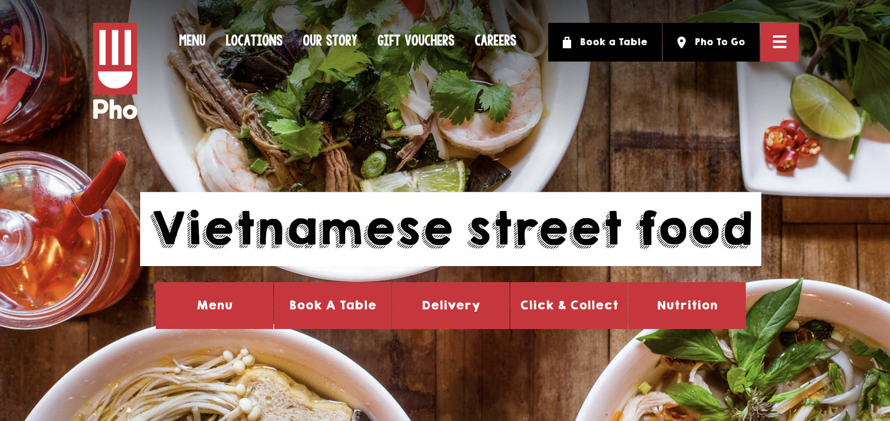
However, almost a year later now, how much has changed? Is it possible to create an exact replica of the site’s header from the block editor?
Yes and no. As usual, it depends.
As a developer and designer, I am confident that I could do it with custom code. Considering this would likely be a one-off design for a paying client, I would be comfortable with that.
Creating this as a part of a publicly-released, general-purpose theme would have a ton of roadblocks with that level of customization. However, it would be possible to capture much of the character, the essence, of the design.
As for building it directly from the block editor, there are still some severe limitations. However, that is what I challenged myself to do. I wanted to get a feel for where the site editor was at without writing CSS code.
The following is the result:
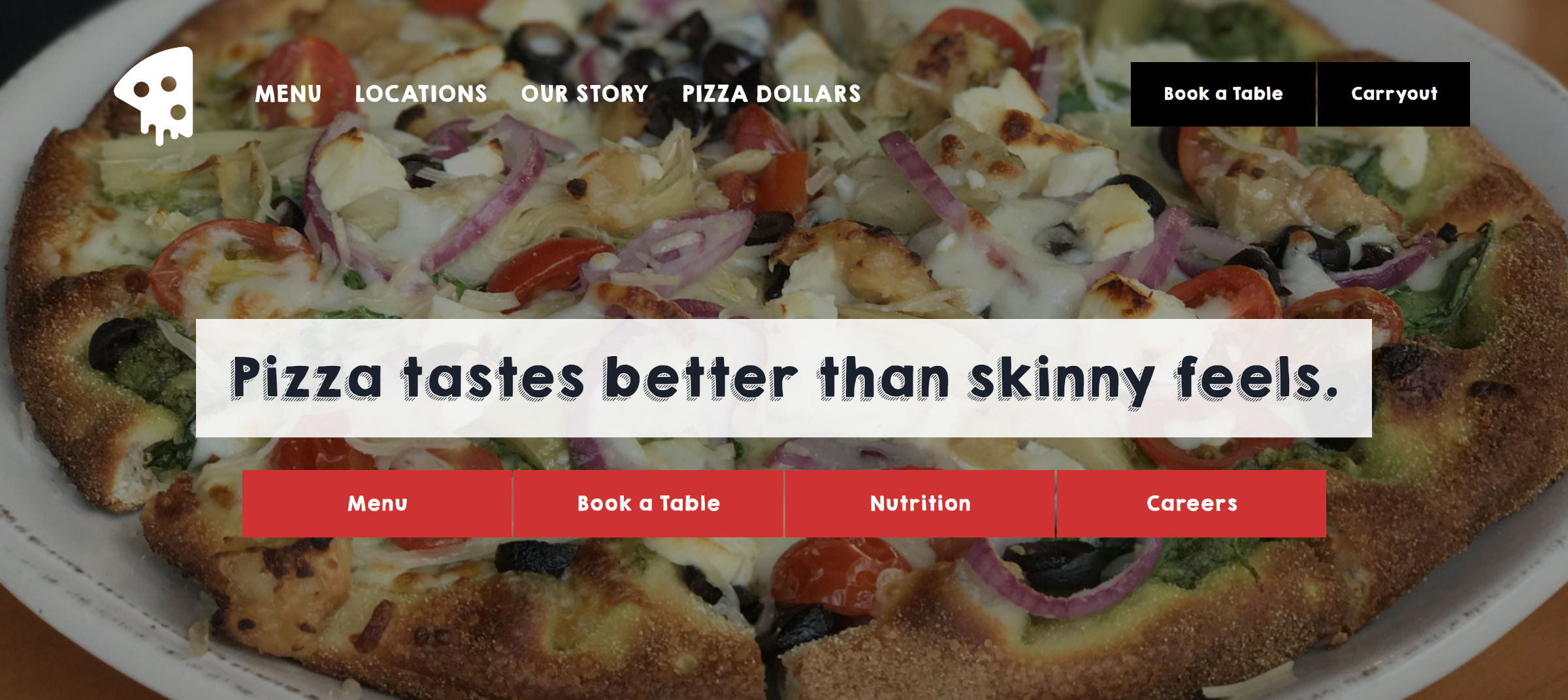
Pizza photo credit: Jennifer Bourn
Technically, I did write a little code to load the KG Happy font. Outside of that, I just forked a block theme I had on hand and changed the “wide” size. I created everything else 100% from the site editor.
Here is a screenshot of the design from the editor itself:
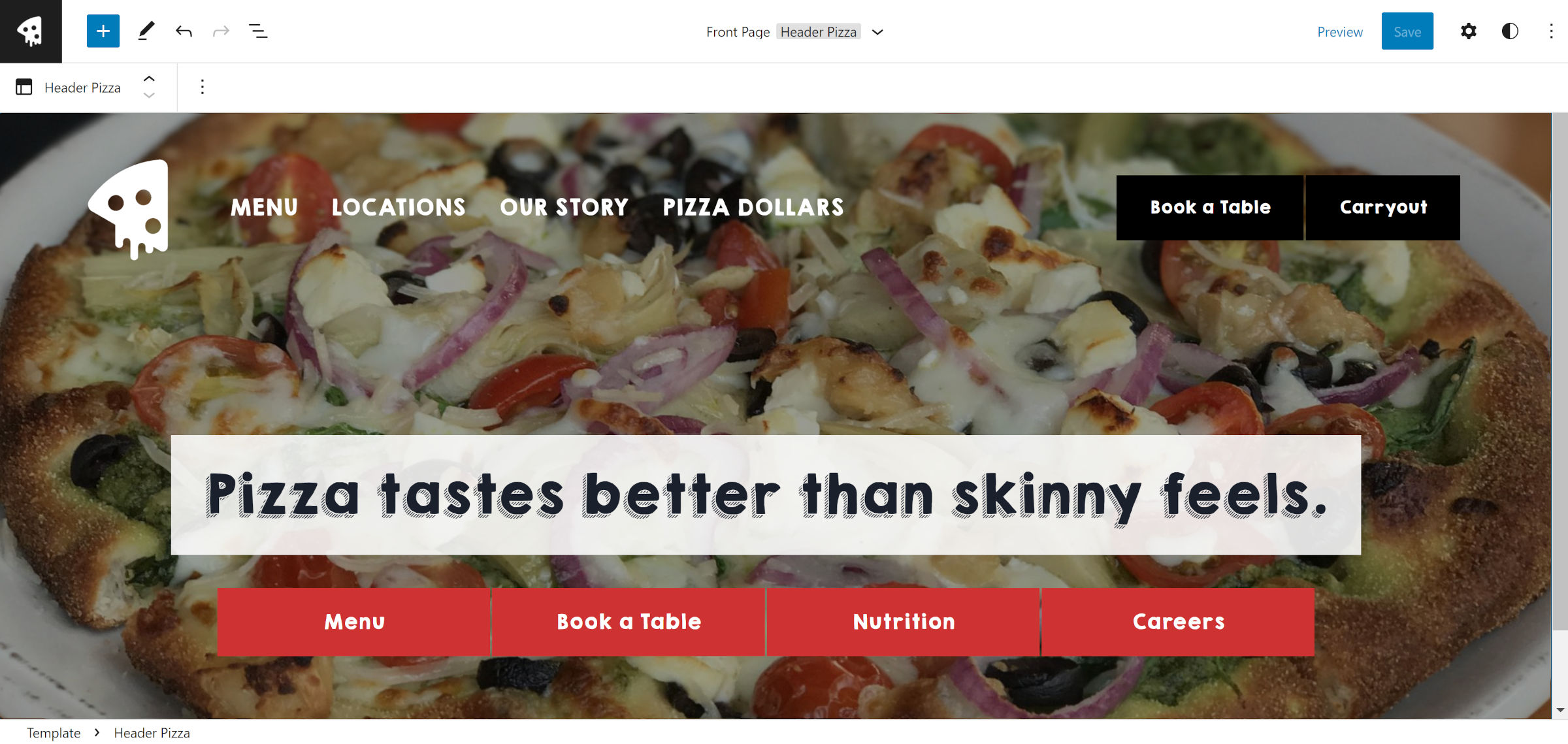
On the whole, this went surprisingly well. In a year, the site editor has become far more powerful.
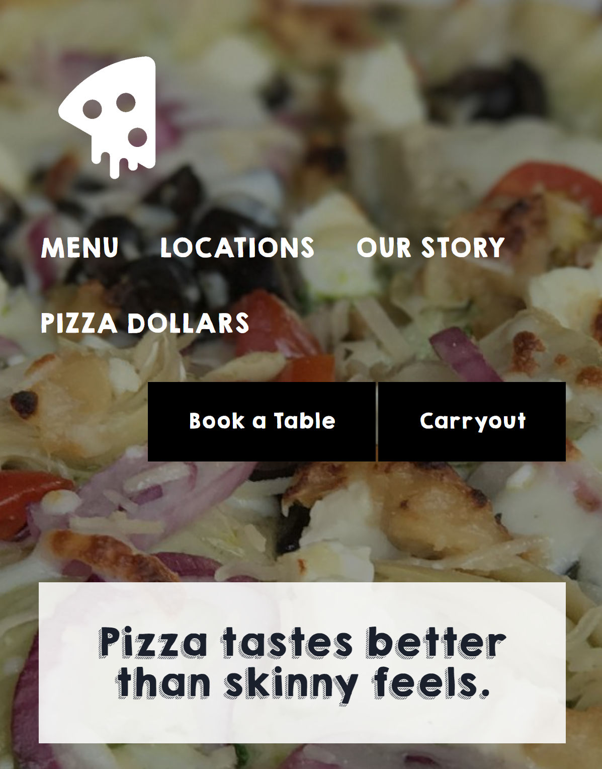
As I said, it still has its limitations. Anyone who has worked with block themes will likely tell you the issue with the layout in the above screenshot. The problem area is the Columns block used for the Site Logo, Navigation, and Buttons across the top. You might as well hang up any hope of that working well on smaller screen sizes.
Is it entirely unusable? No, but it is not anywhere near close to ideal.
Without responsive controls on layout-type containers like the Columns block, designing anything complex with the site editor can sometimes feel like one giant hack. At this point, this is not a revelation of any sort.
There are tons of improvements with block design tools in comparison to last year. The core block gap, margin, and padding controls are a godsend for adjusting vertical and horizontal spacing. Back then, even the thought of having any control over this was a headache-inducing affair. Except for a few blocks still missing these options, it is now [mostly] stress-free.
I hit no spacing-related problems in this experiment. That feels gratifying to say after over a year of testing FSE features.
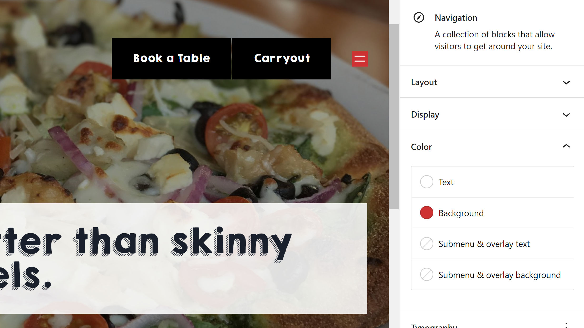
However, I did hit some other roadblocks. The Navigation block may be my least favorite thing about the site editor. I have yet to see how it will offer a universal system that plays well with the 1,000s of design variations that theme authors will want to employ. Classic nav menus are still vastly superior for custom design.
I ran into two primary issues with this experiment. One of the problems I had a year ago with FSE Outreach #4 was creating a menu that had button-like links. This basic design is still impossible with the Navigation block, at least with the core design tools:

Users can add a background to the entire Navigation block but not to the individual menu items. How did I do it? I used a Buttons block instead.
The more I think about it now, the more I like the Buttons block alternative. However, there is no way to wrap this in a <nav> tag to define it as a navigation element.
One missing piece of the header I was attempting to replicate was a mobile menu at the far right of the layout. WordPress’s mobile Navigation menu icon provides no customization options. Users can customize the overall background and text color but not target the button directly. I faked it a little by narrowing down the column:
There was no way to make the mobile icon larger or give it any padding to align its size with the Button blocks next to it.
The Navigation block, despite its progress, is still one of the weakest links in FSE. It only covers a handful of simple use cases out of the box. Anything beyond that requires a deep level of customization and the hope that an end-user does not break the delicate balance struck to make it work.
Twice during testing, my Navigation block disappeared on the front end. I suspect it had something to do with me trying to adjust the outer Column block’s width. However, I was unable to replicate the issue at will.
Testing is all about finding problems to solve. I did not run into any crashes or the types of bugs that I would have seen long ago. The experience of designing from within the site and template editors feels pretty smooth these days. The holdups are more about missing capabilities than anything. Making the leap from an impossible header layout to an almost possible one in 11 months is significant.