
It is literally the one thing that no one was asking for, but we can all collectively agree it is kind of cool. A block-based version of the old-school Kubrick WordPress theme exists.
Gutenberg lead Matías Ventura tweeted a quick video of it in action yesterday. Fellow Automattic engineer Riad Benguella had put the theme together.
Wait, what?
(I had no part in this, all credit goes to @riadbenguella.) pic.twitter.com/2WF8HShvSa
— Matías Ventura (@matias_ventura) December 15, 2021

I am always on the lookout for those nostalgic plugins and themes that harken back to my early days on the web, the early-to-mid 2000s, the golden age of blogging. And, there is nothing that embodies that more than Kubrick, WordPress’s second default theme. It was literally named “Default” and represented the platform for over half a decade.
Even today, Kubrick/Default still has over 10,000 active installs. I wonder whether it is running on now-defunct sites or if the number represents still-active bloggers.
The theme was the face of WordPress during its rise to dominance as a CMS. Theme authors owe more credit to it than any others. It was copied, forked, repackaged, and redistributed more times than most of us will likely ever know.
Kubrick 2, as it is named in the GitHub repository, is still a work in progress. There are still a few kinks, such as single posts showing the excerpt instead of the full content. However, it is a working theme.
The shocking thing about it is how little code it took to recreate Kubrick with the block system. The original theme, last updated in 2020 and now at version 1.7.2, falls short of 11 kb of CSS. I cannot remember the last time I saw a classic WordPress theme with so little code. The block-based version currently uses a handful of theme.json settings and has no CSS.
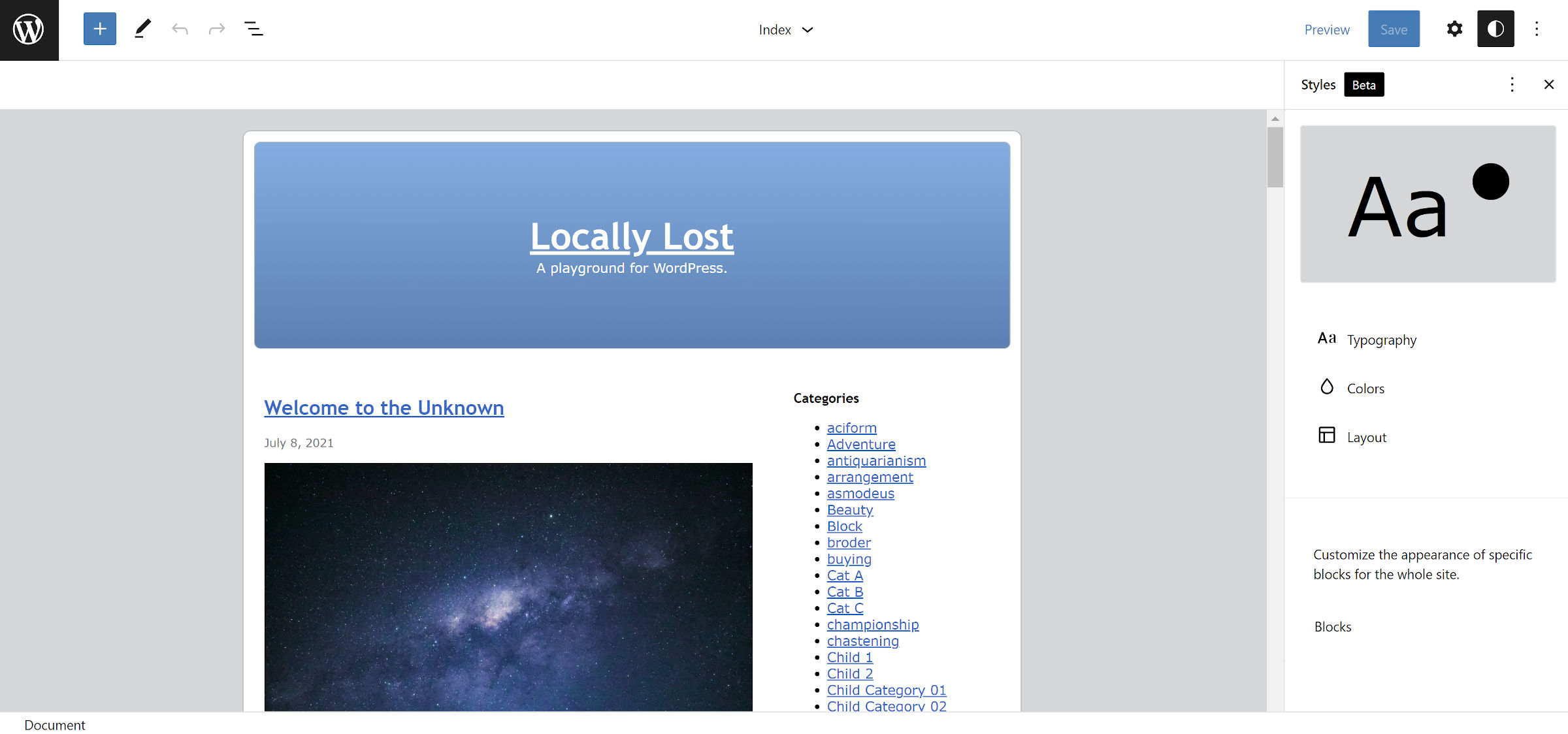
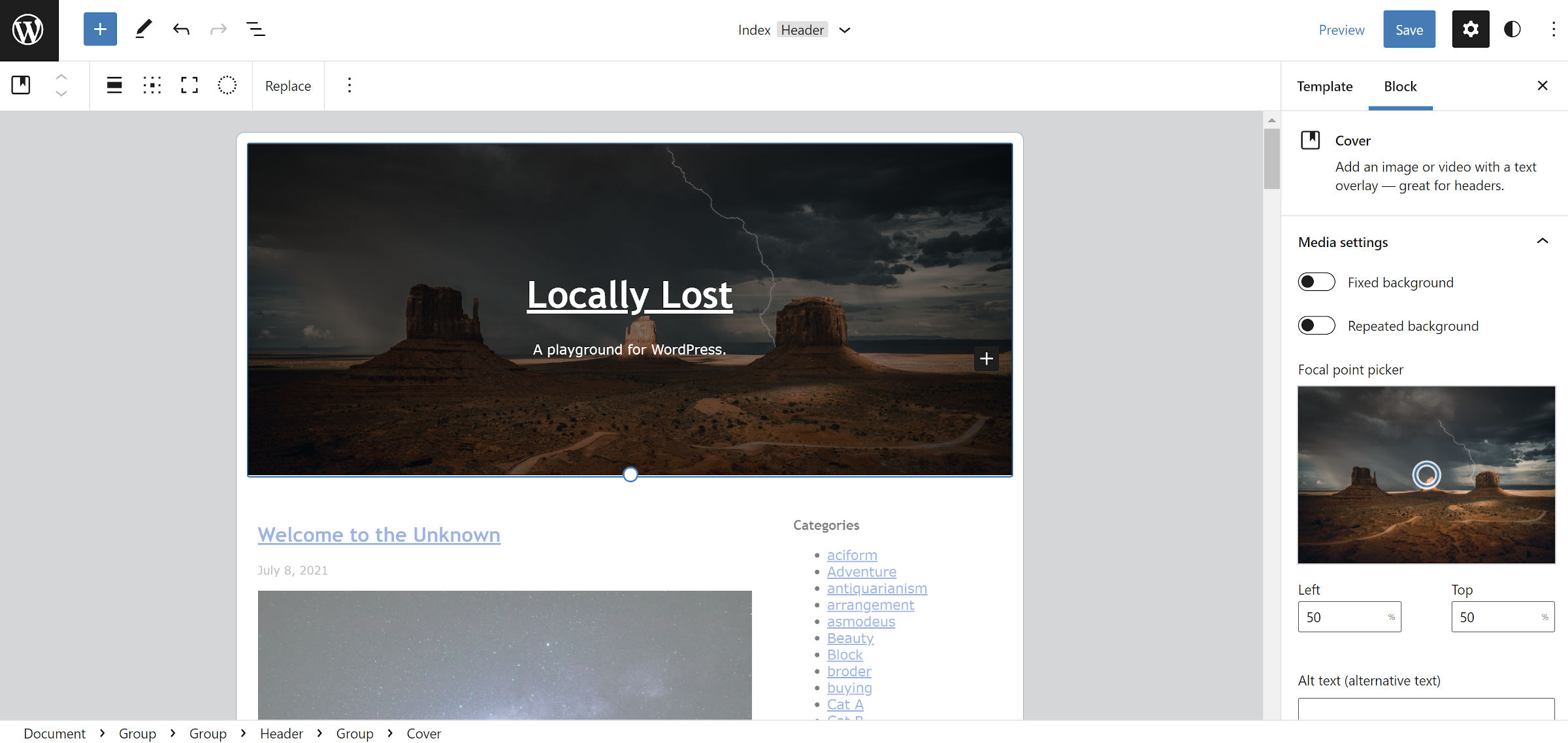
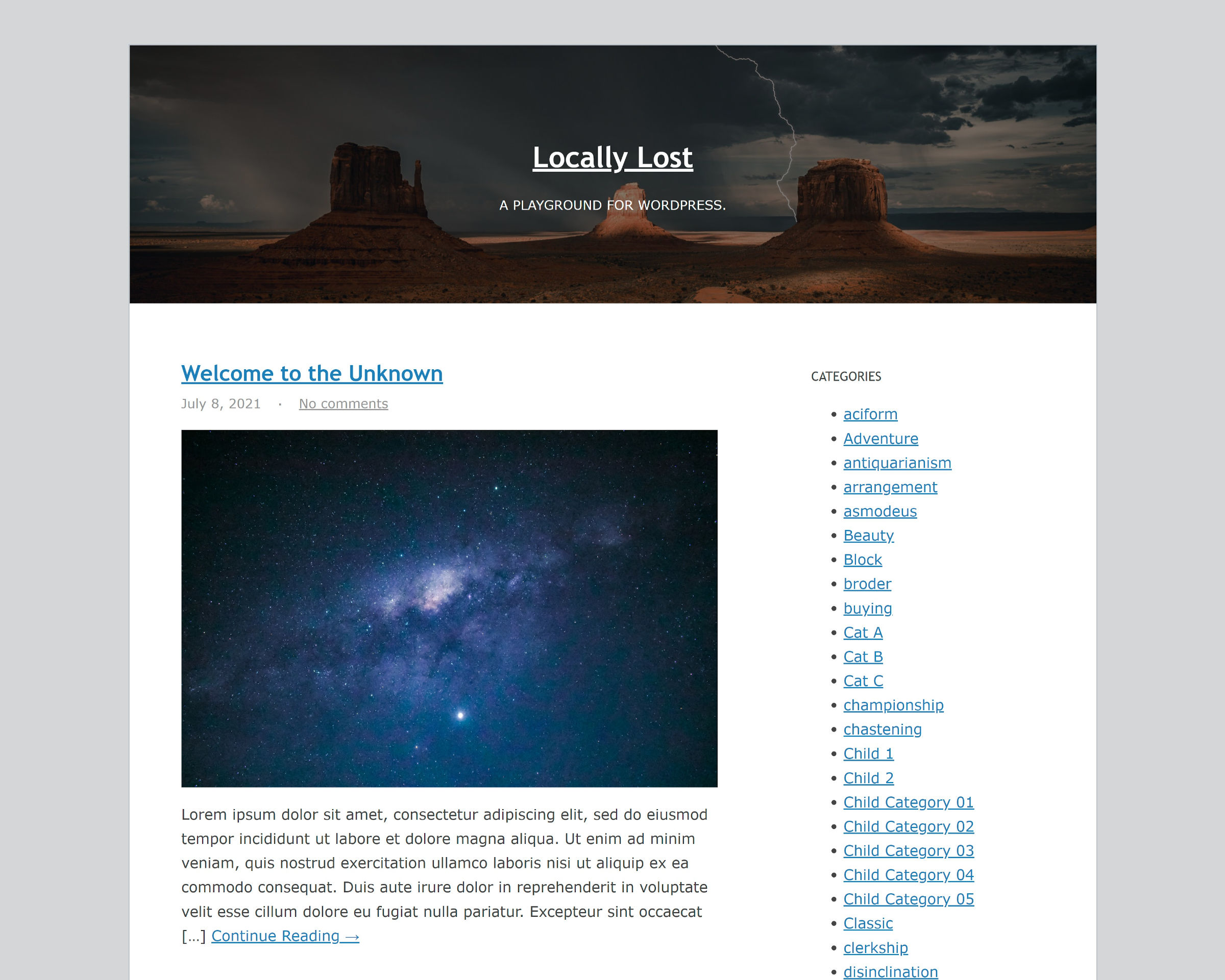
Of course, it did not take me long to dive into the site editor and start customizing. The most recognizable design aspect of Kubrick was its gradient-blue header. It was also one of the pieces that users from around the blogging world would customize to make their site feel like their own. They would decorate it with custom colors, gradients, and even images.
Today, with the block editor, that is far simpler than a decade and a half ago. Plus, there are more options.

With such power in my hands back in 2005, I am not sure if I would have pursued theme development at all. I probably could have done everything I needed to do within the WordPress admin. Kubrick was one of my first introductions to theme design, and I owe an unpayable debt to it. It is nice to know that its legacy continues to live on.
For old time’s sake, I spent a few minutes making modifications via the site editor — ever so slightly modernizing it. However, I did not want to lose the flavor of the original work.
I am as comfortable as anyone can be in the editor. I know most of its pain points, but this somehow felt more natural than usual. Maybe it was the simplicity of a theme from a bygone era. Perhaps the site editor and I were just seeing eye to eye today. Or, it might simply have been in the cards. I had a lot of fun venturing down memory lane.
I doubt Kubrick 2 sees a lot of action in the real world. Maybe a few folks who are as nostalgic as I am will install it when it is ready for production.
Much like Ian Stewart did with Kirby in 2010, maybe some adventurous theme author will take it upon him or herself to build a modern-day successor to Kubrick. One that both leans into the block system and has readable typography. I am getting older and blinder. A 13px font size is not as easy on the eyes these days.