
Automattic’s Skatepark landed in the WordPress.org theme directory on Monday. It was designed for modern events and organizations, but it should work well for many sites with a small amount of customization.
For those keeping count, it is number 52 on the long path toward the 3,000 themes project lead Matt Mullenweg hopes for before the Collaboration phase of the Gutenberg project. The pace has picked up in the past few months, but the lower-cited number of 300 seems more realistic.
One thing seems inevitable. The Automattic Theme Team will continue pushing new block themes out. Skatepark is now its 10th contribution, nearly a full 1/5 of the total available on WordPress.org.
With the release of the Blockbase theme last year, I expected that most of Automattic’s theme releases would just become child themes of it. They would be slight variations on that same design, never really pushing the envelope. After all, that is how most of their block themes seemed to be rolling out. However, the Theme Team’s last three releases have been standalone. Skatepark graduated from child theme status a mere eight days ago.
I like seeing this approach. Child theming can have its limits, often tucking designers into unnecessary boxes. The team’s latest theme needed to be let loose to do its own thing.
If there was ever a theme design that marched to the beat of its own drum, it would be Skatepark.
The color scheme is…how do I describe this? THERE. IS. SO. MUCH. GREEN. Blindingly so.
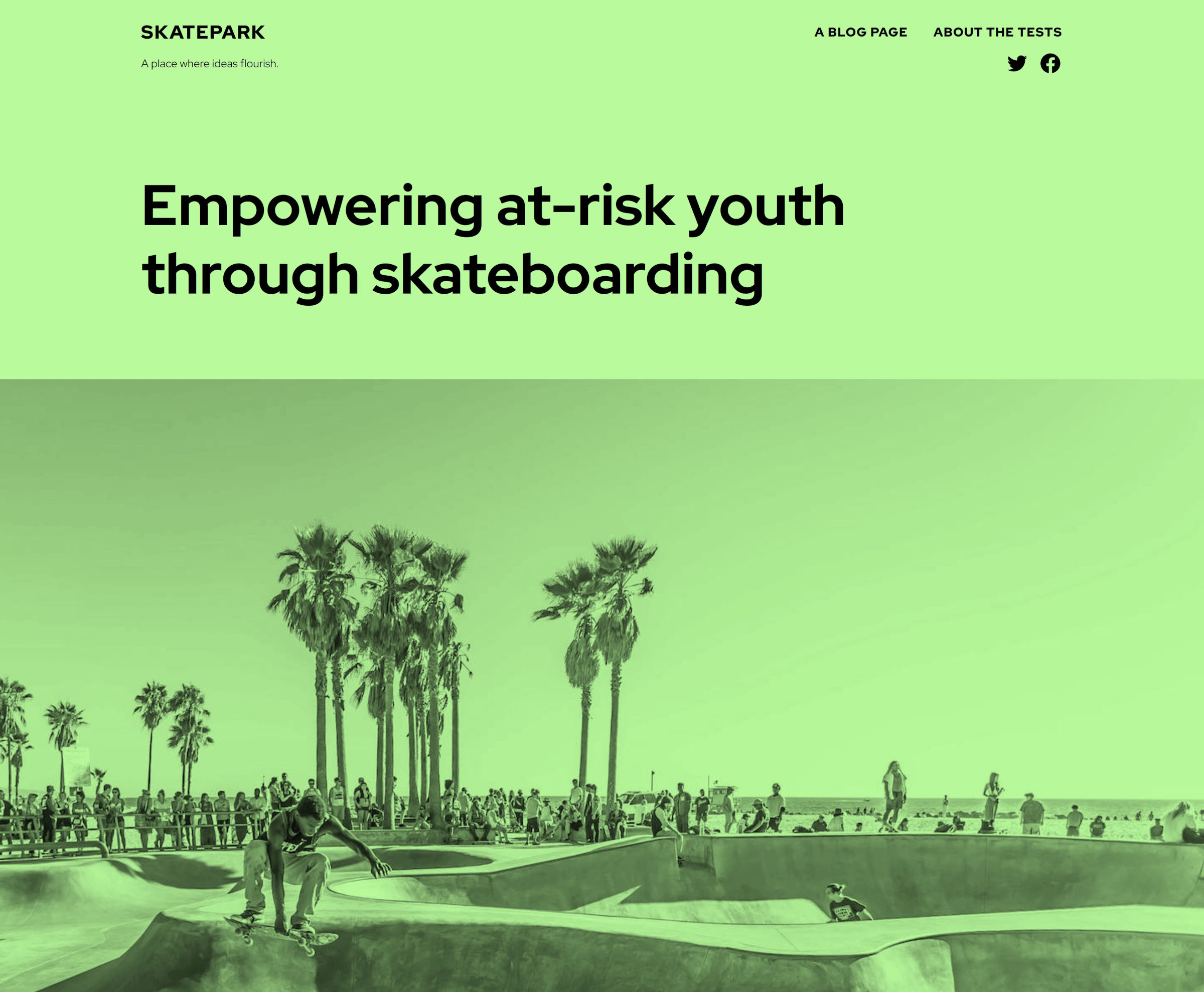
I love the experimentation. We need more of that in the WordPress community. As much as I dislike the default color scheme, it is likely perfect for someone else.
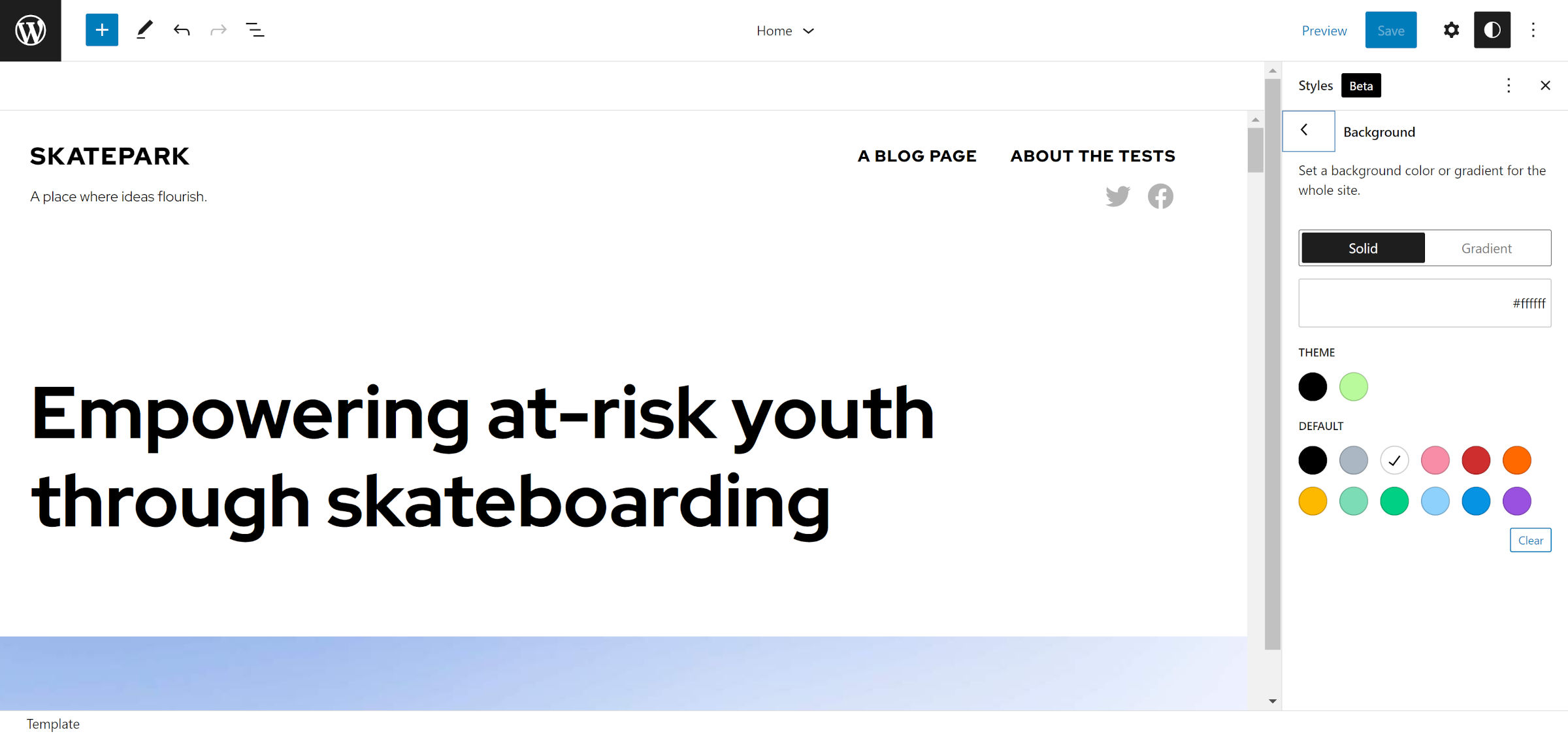
I would have instantly deactivated and deleted the theme in the classic era. But, the site editor and global styles system let users modify colors with relative ease these days.
The first order of business was changing things so that I could explore this theme properly:
Once my eyes readjusted, I enjoyed tinkering with this Skatepark. There is a lot to like about it from just a general-usage standpoint. The bold typography choices and generous use of whitespace give users the freedom to experiment.
However, the theme provides a helping hand for those who need it. Skatepark includes 10 block patterns out of the box.
My favorite is also the simplest. The “Columns in container” pattern is a Group block that wraps a few other elements:
It does not seem to be trying too hard, merely creating a functional and handy layout. Often, that is just what users need.
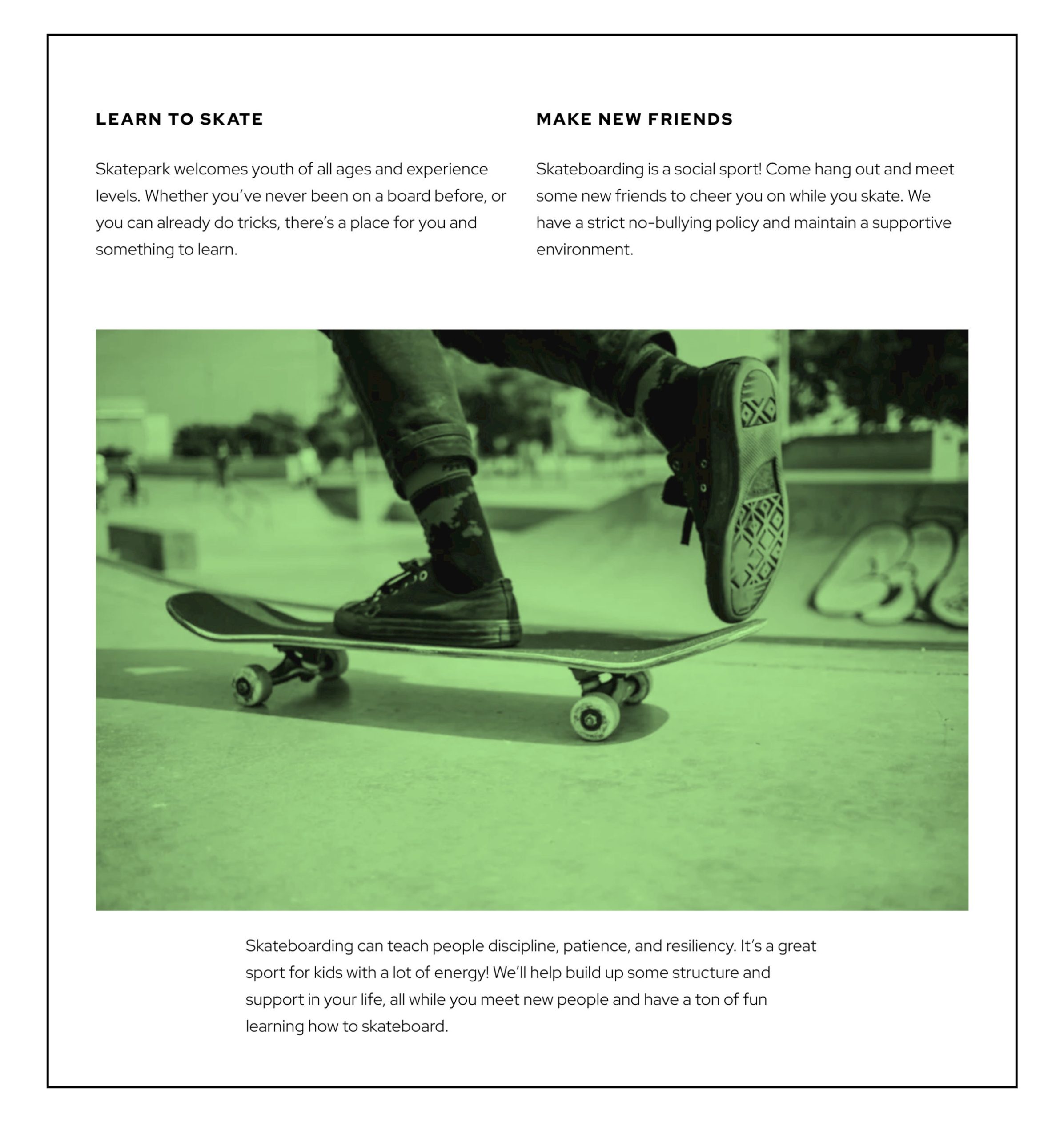
One of its unique patterns is “Full width image with aside caption.” It places an Image block in the content, followed by a Columns block. The “caption” in this case is not a caption at all. Instead, it is a Separator and Paragraph.

I love this concept, but I question the implementation. The design itself could have been accomplished with a custom block style on the Image block and a few lines of CSS targeting the caption element. Perhaps the team wanted to provide users more customizability.
Captions are not currently self-contained blocks. However, there is an open ticket to separate them from their parent containers. The change would give theme authors and users more design freedom.
I am generally not a fan of the offset-column patterns that seem to be a signature of the Automattic’s themes these days. There is definitely a bit of that mixed in. However, the “Paragraph with quote” pattern fits well with the overall design, the primary column aligning with the text above it.
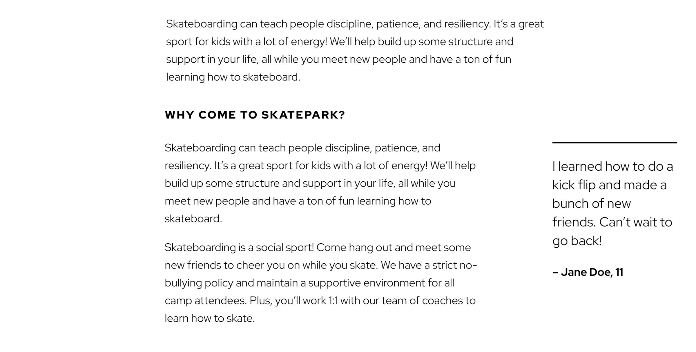
Technically, this is a three-column design. The left column is empty, and the other two columns hold the content. It gives the illusion that the Quote block is the only thing moved outside the container.
I have seen this technique employed to align blocks in the past. At best, it works as a quick hack, but it has a shaky foundation that crumbles at various screen sizes. It also shows that the block system still lacks a robust set of layout tools. In 2022, there are so many ways to accomplish this design with CSS instead of column hacks. However, theme authors use the tools they have on hand. Until the core design tools mature, they will continue experimenting and innovating in their own way.
I welcome the experimentation in the Skatepark theme. The default green may never be my cup of tea, but that is OK. I want to see theme authors pushing boundaries and trying new things. Plus, underneath it all, the theme includes one thing that Automattic almost always gets right: legible typography.