
Yesterday, Anariel Design’s third block theme, Bricksy, went live in the WordPress.org directory. Ana Segota, the co-founder and self-proclaimed “creative motor” of the company, has almost become a master at block-based theme design at this point, and this project is just her showing off her skills.
I actually took the theme for a spin over the weekend when I saw it was waiting in the review queue, so I have had a few days to play around with it. Despite a few trivial issues, it has quickly become one of my favorite block themes.
While I have generally liked Anariel Design’s two previous block themes, Naledi and Clove, I could not see myself installing them on a real-world project. They were simply not my personal style. However, Bricksy is a theme I would definitely use if I had a project for it at the moment.
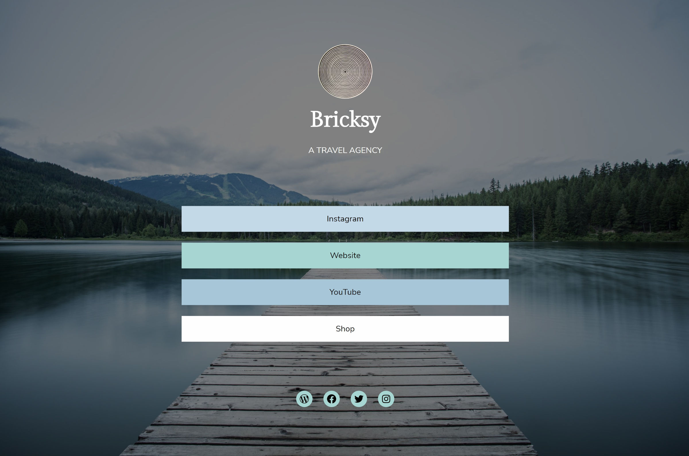
One of my favorite design elements is the cursive handwriting for the site logo, which is also used across various patterns.
The downside is that these are images, so they are not easily recreated by end-users without Photoshop chops. I would like to see the team reconsider using a handwriting-style font — maybe one from Google Fonts — that allows users to add custom text directly from the editor.
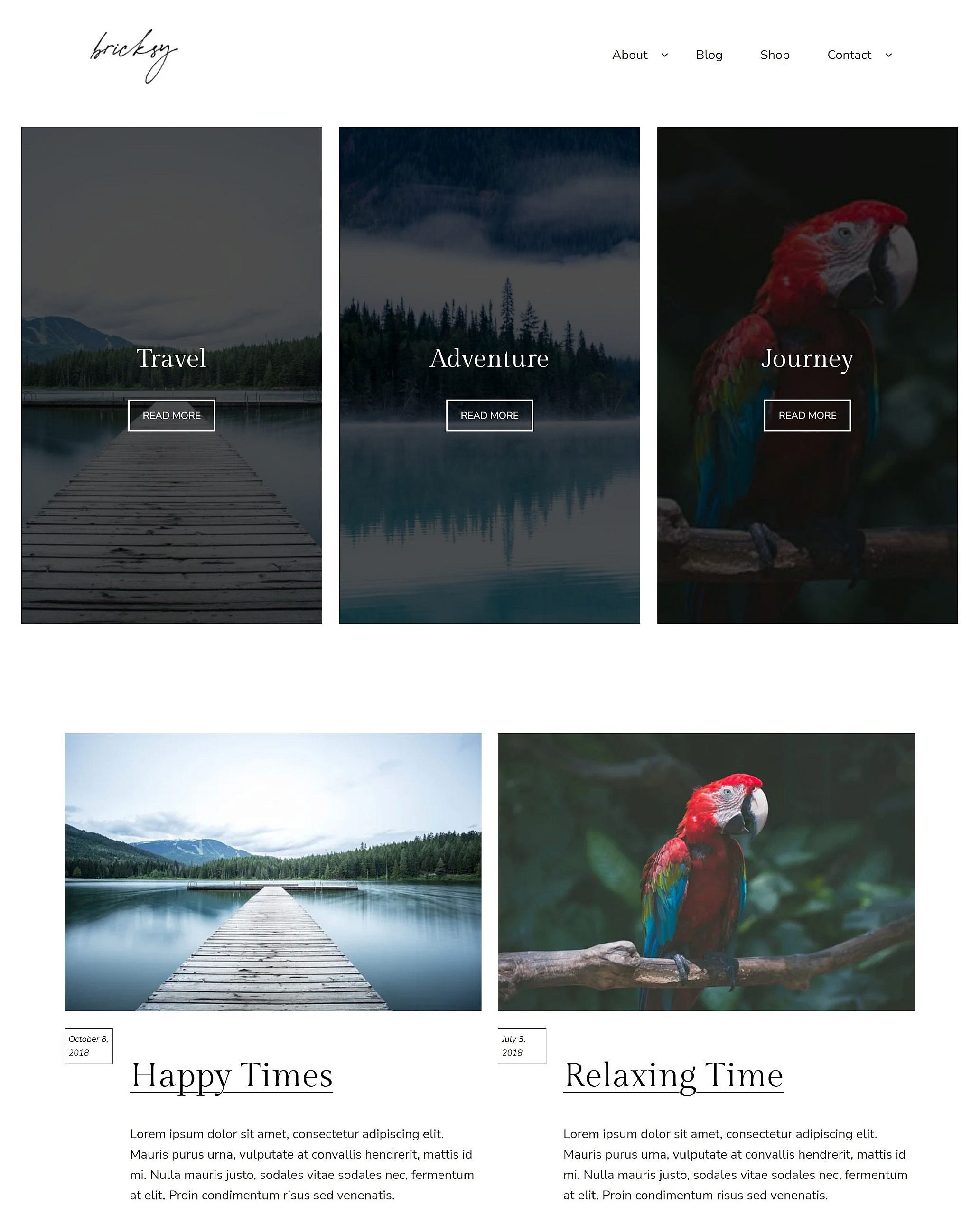
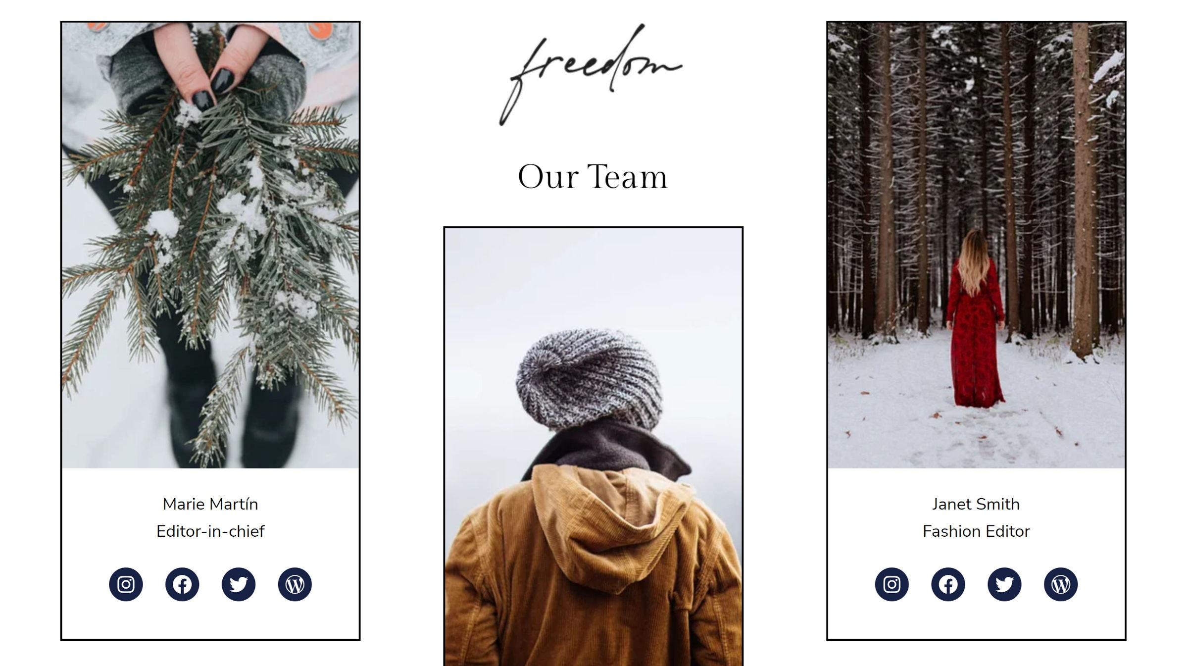
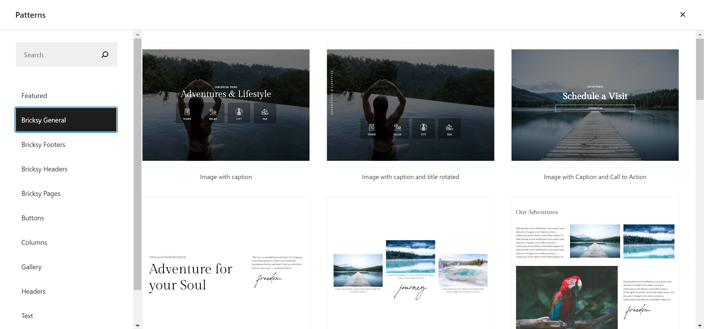
Bricksy has, hands down, some of the most beautifully-designed patterns I have seen in a block theme yet. In total, there are 32.
It is making an early bid for my favorite theme of 2022, but I will not get ahead of myself. We still have almost an entire 12 months to go before I make that call.
It even includes a custom social links layout. More and more themes are bundling their own takes on this pattern, but Bricksy’s color scheme and default Cover block image stand out.
With 32 patterns, I could dedicate an entire post to them all, but I am limited on time. For the most part, they are layout-focused rather than industry-focused patterns. This means they can be used on a vast range of sites. However, the pricing tables and team sections make sense for small businesses. Bricksy also supports WooCommerce.
The most striking thing about each pattern is that they all seem to fit within the theme’s overall design. Often, when themes include dozens of block patterns, some of them can feel like an additional option simply for the sake of adding one more thing in. And, that never feels like the case with Bricksy.
For long-form content, the theme is decent. However, it could be better. Its 720px content width and 18px font size can quickly grow hard to read. Cutting the width anywhere from 80px to 120px makes it much more comfortable. Bumping the font size up a couple of extra pixels works too.
When I first activated the theme, I thought it was utterly broken. I had wondered how it managed to slip through the review system. The theme’s header was outputting seemingly random demo content. But, it was also familiar. I was positive it was a test post from my install.
The issue was tough to hunt down. After everything from deactivating plugins to scrubbing templates from the database, I finally found it. The ref key for the Navigation block in the theme’s header.html template part was the culprit. Bricksy pointed to a specific post ID in the code:
<!-- wp:navigation {"ref":4790,"layout":{"type":"flex","setCascadingProperties":true,"justifyContent":"right"}} /-->4790 is the ID of a literal post on my test install, so the Navigation block showed its content instead of a menu. Most likely, this was directly copied or exported from the site editor. Theme authors need to watch out for specific ID references in their code when building from the editor, making sure to remove them before shipping.
Aside from a couple of trivial issues and a single OMGBBQ one after activation, I enjoyed using the theme. It has found its place in my recommended-themes list.